
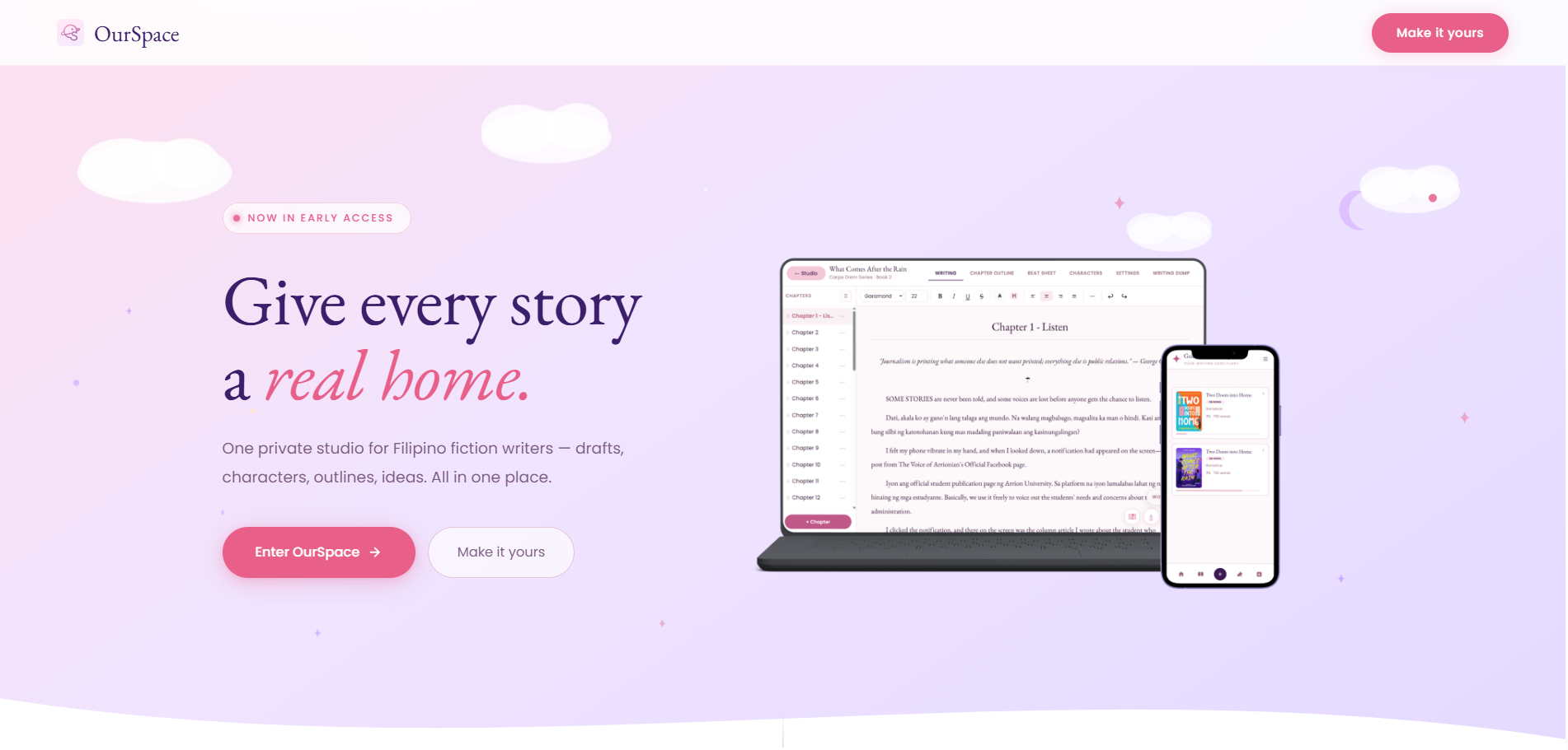
Filipino fiction writers were juggling five or more separate apps — docs for drafting, spreadsheets for outlines, chat apps for character notes, socials for reader feedback — with nothing built for how they actually write.
Designed and built a single writing studio combining drafting, chapter organization, outline tools, and community feedback into one connected flow, launched in early access.
A private studio that replaced five scattered apps with one.
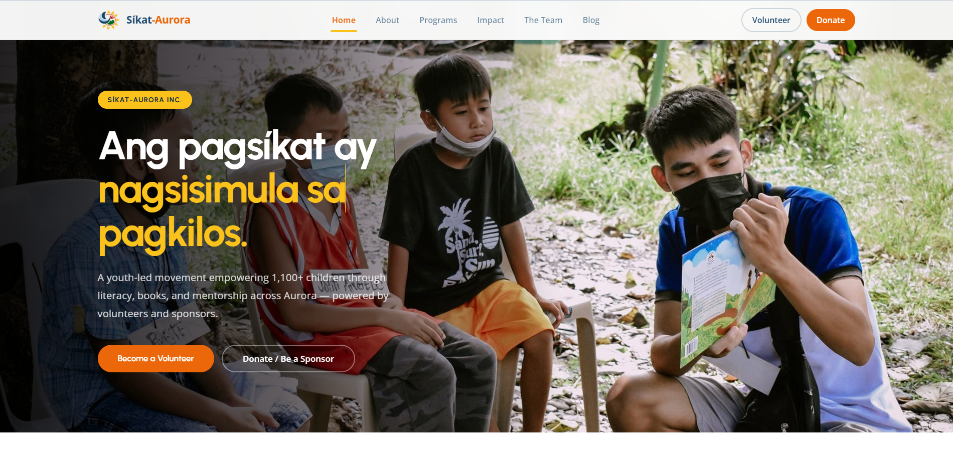
A youth-led literacy nonprofit in Baler, Aurora needed a site that could turn visitors into volunteers, donors, and sponsors — not just explain the mission.
Structured the entire site around three clear action paths — volunteer, donate, sponsor — so every visitor has an obvious next step regardless of how they want to help.
A youth-led movement site organized for action, not just awareness.
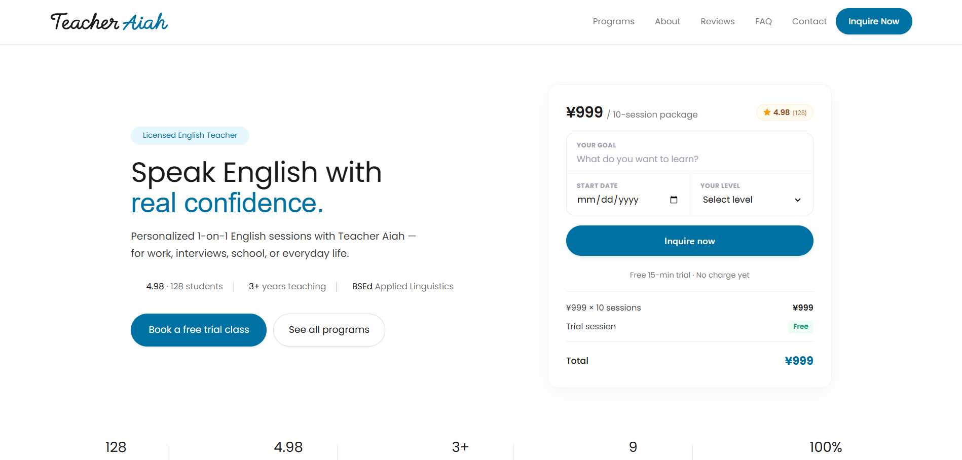
Interested students were dropping off before booking a session — the inquiry process wasn't clear enough to turn interest into a booked class.
Rebuilt the landing page around a single, focused booking action, with pricing and trial details front and center instead of buried in navigation.
A tutor landing page built around one clear inquiry action.
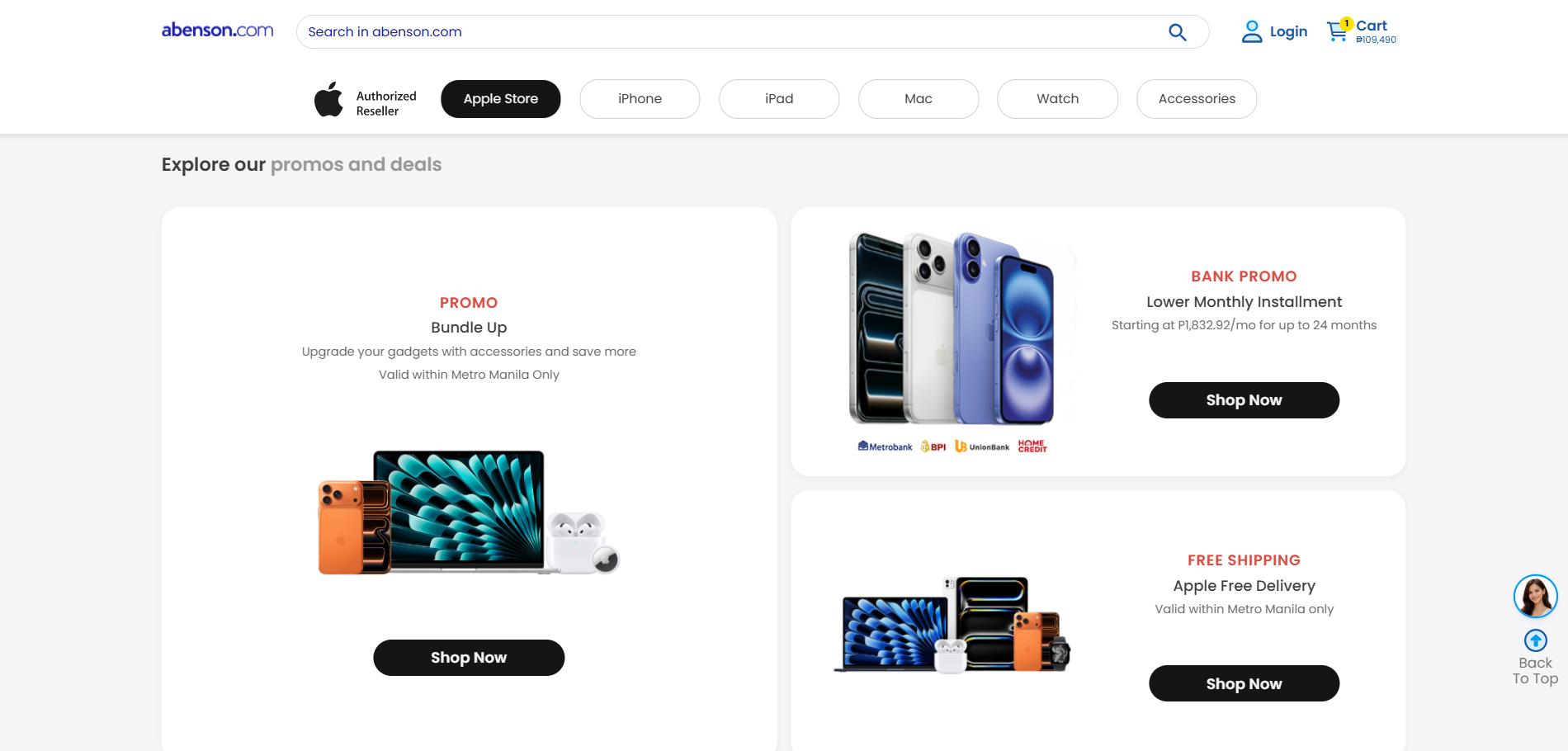
A large product catalog on a major PH retailer's site risked feeling overwhelming and hard to browse.
Reworked the product hierarchy and page structure so the catalog feels curated rather than dumped, guiding shoppers toward the right category faster.
A brand storefront that shapes a large catalog into a clear path.
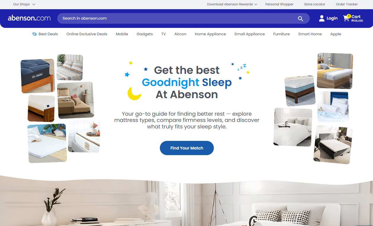
Mattress and sleep shopping is a considered purchase — shoppers needed a way to compare options by what actually matters to them, not just browse a product grid.
Organized the sleep-range landing page around the real decision factors shoppers use: comfort, size, and budget.
A sleep-range page organized around how people actually choose.
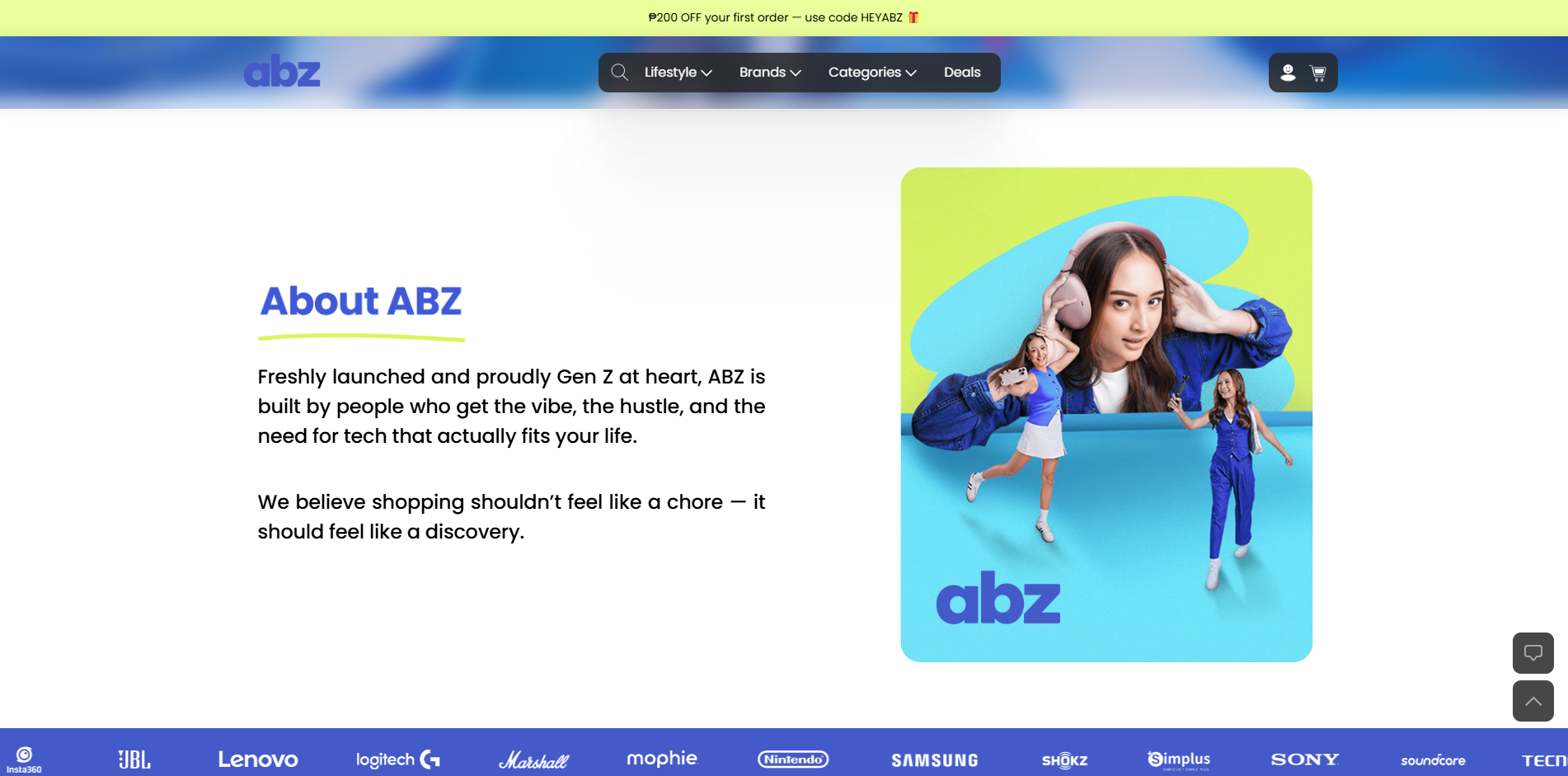
Abenson wanted a distinct storefront that spoke to a younger, Gen Z audience without diluting the parent brand.
Positioned ABZ around value, exclusive perks, and fast delivery — the priorities that matter most to a younger, mobile-first shopper.
A Gen Z-focused lifestyle tech storefront under the Abenson brand.
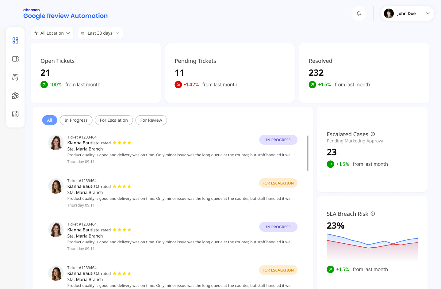
Manually tracking and responding to Google reviews across multiple Abenson store locations was slow and inconsistent.
Designed an internal dashboard prototype to automate review monitoring and streamline how staff track and respond to feedback.
A dashboard prototype for automating review responses across stores.
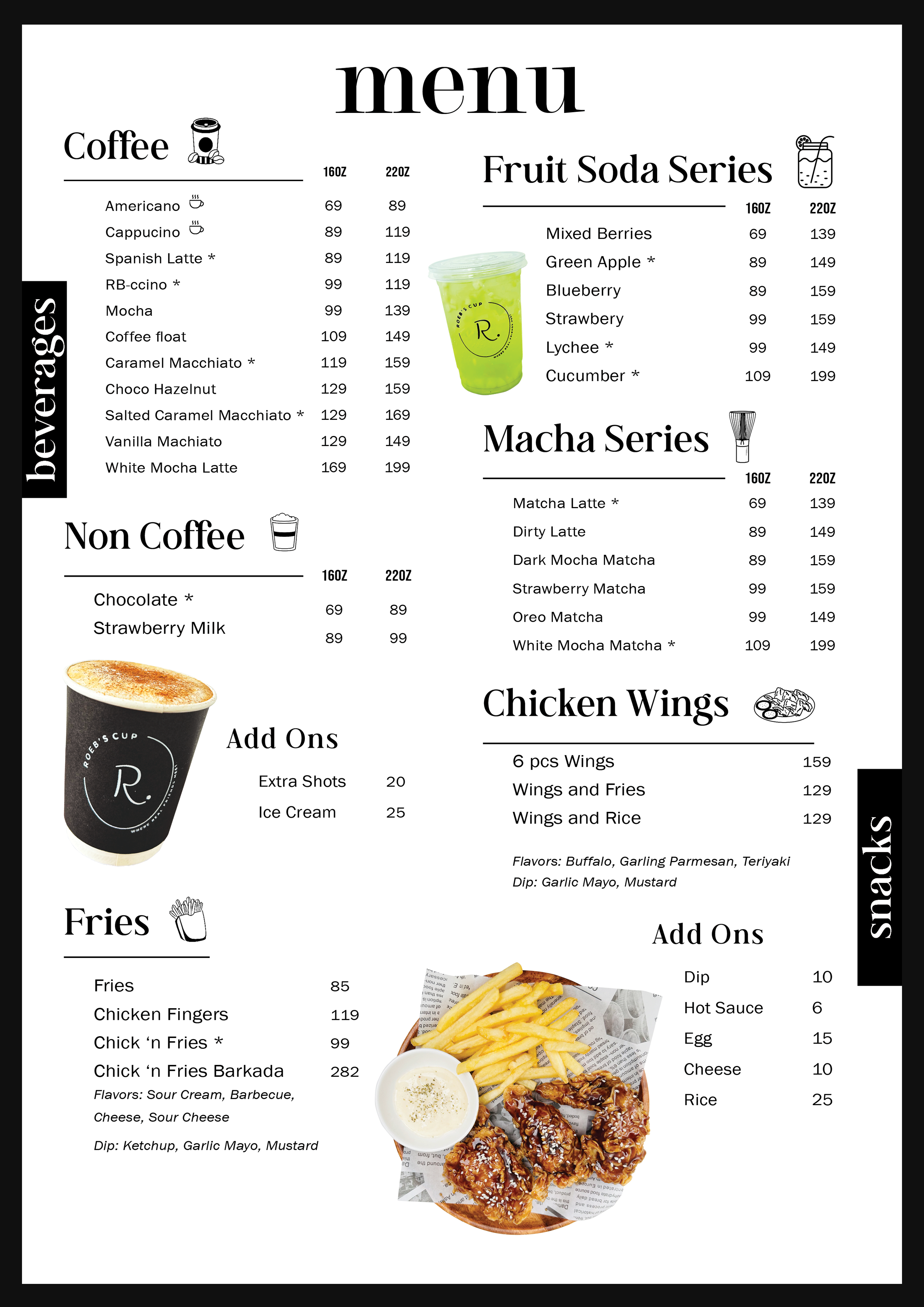
Full menu design and cup branding for Roeb's Cup — coffee, fruit soda, matcha, and snack menus laid out on one branded sheet.
.png)
Two logo marks for the Síkat-Aurora movement — the primary sun-and-moon icon and the Síkat Baler chapter badge.

Logo mark for The Voice of the Sierra, a print publication — a horn, pen, and camera aperture paired with a dove.
.png)
Voucher graphics and product deal ads for LoveShopping.ph's Lazada and Shopee storefronts — pricing and voucher mechanics built for quick scrolling.
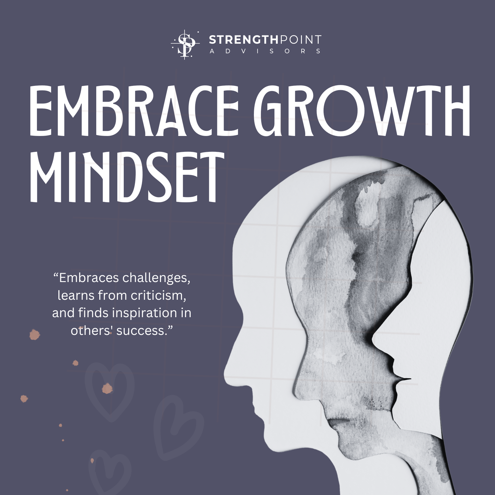
Social media carousels and static posts for a business advisory brand, pairing short motivational copy with clean typographic layouts.
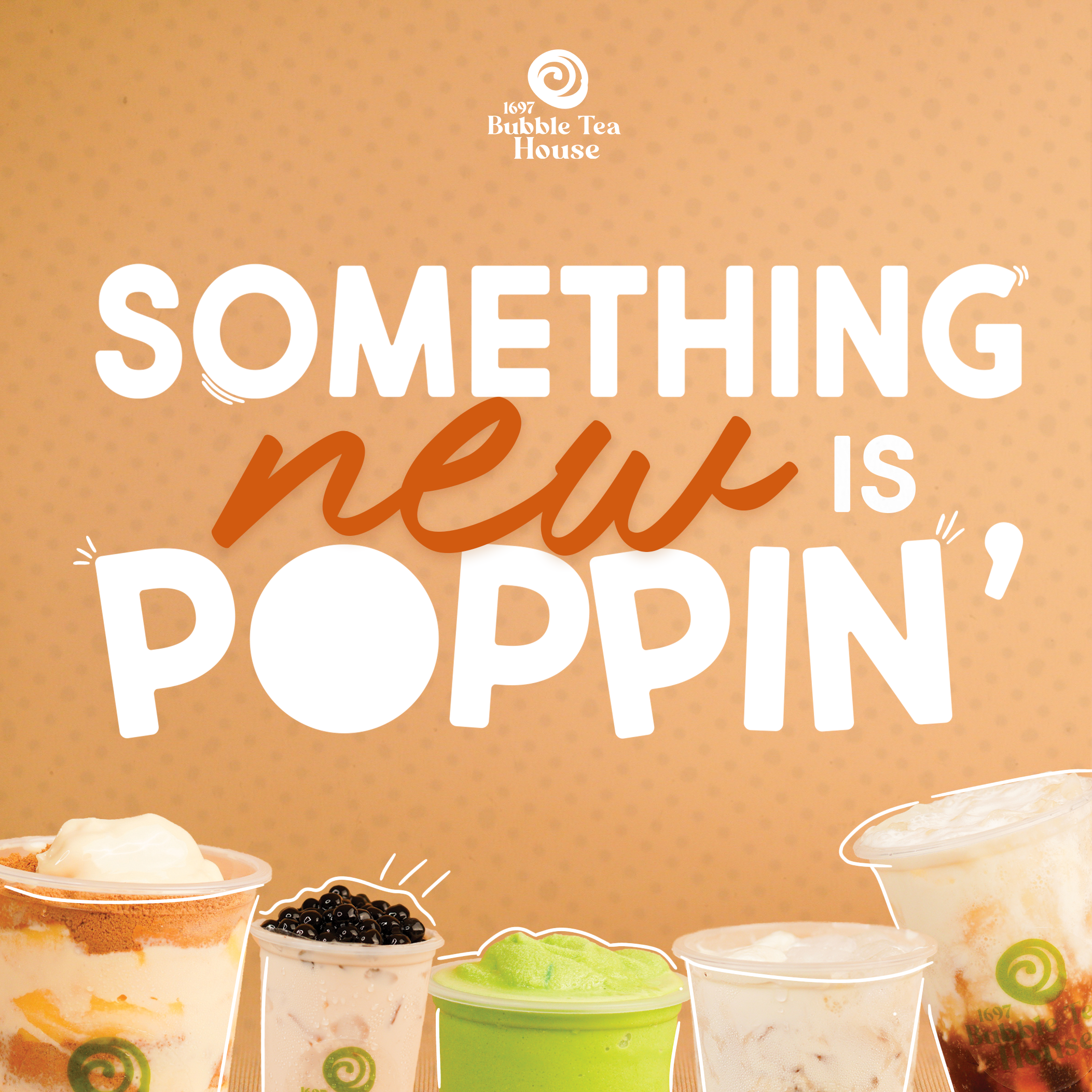
An Instagram-style announcement graphic introducing a new drink lineup for 1697 Bubble Tea House.
.png)
Product ad creatives and customer-review reposts for Urbantech's Lazada and Shopee listings.
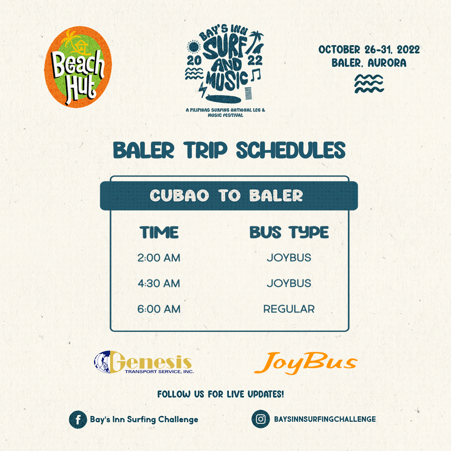
Event graphics for a surf and music festival in Baler, Aurora — trip schedules, sponsor call-outs, and social announcements.
Layout and cover design for The Voice of the Sierra, a print publication.
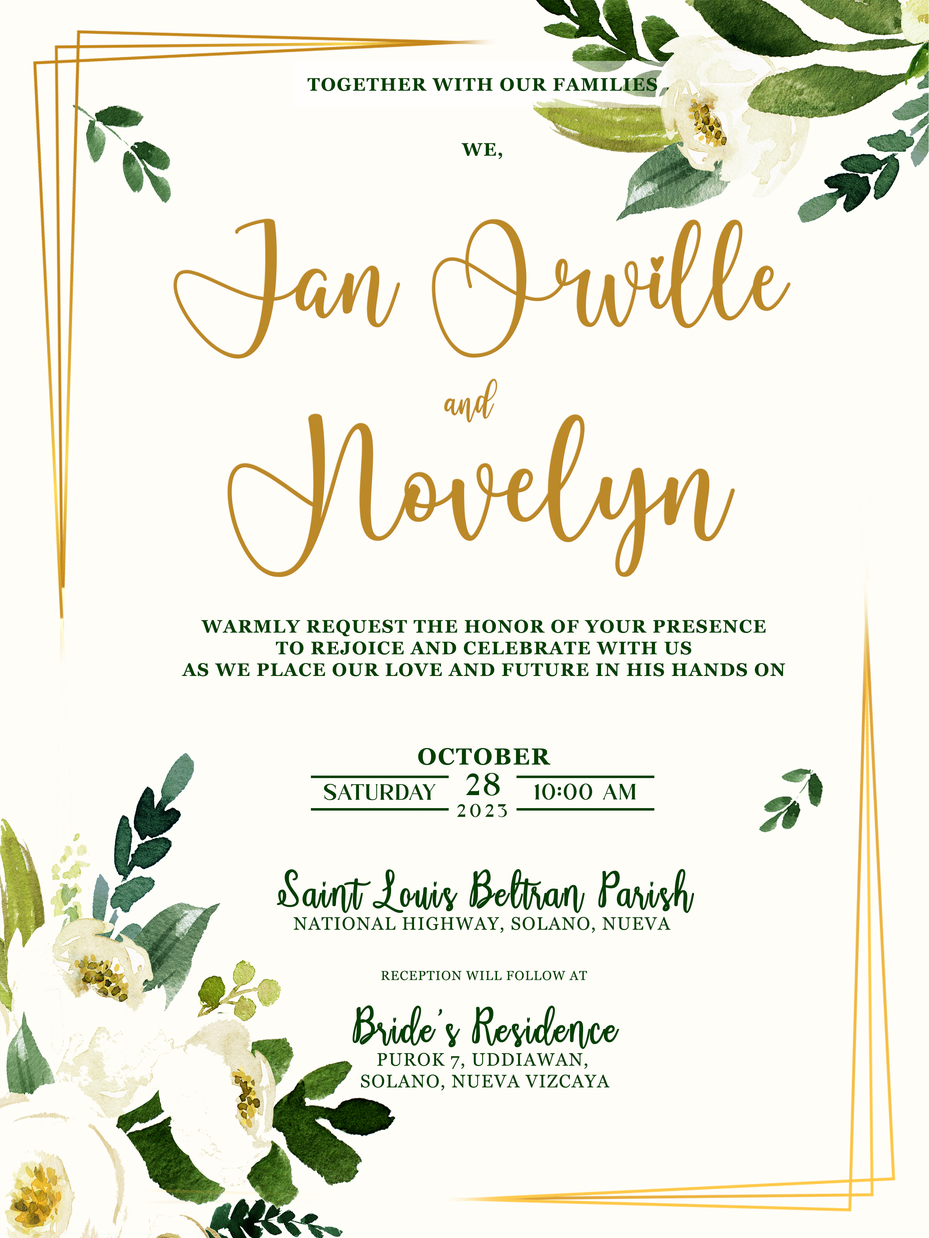
A floral wedding invitation suite designed for Jan Orville and Novelyn's October wedding.
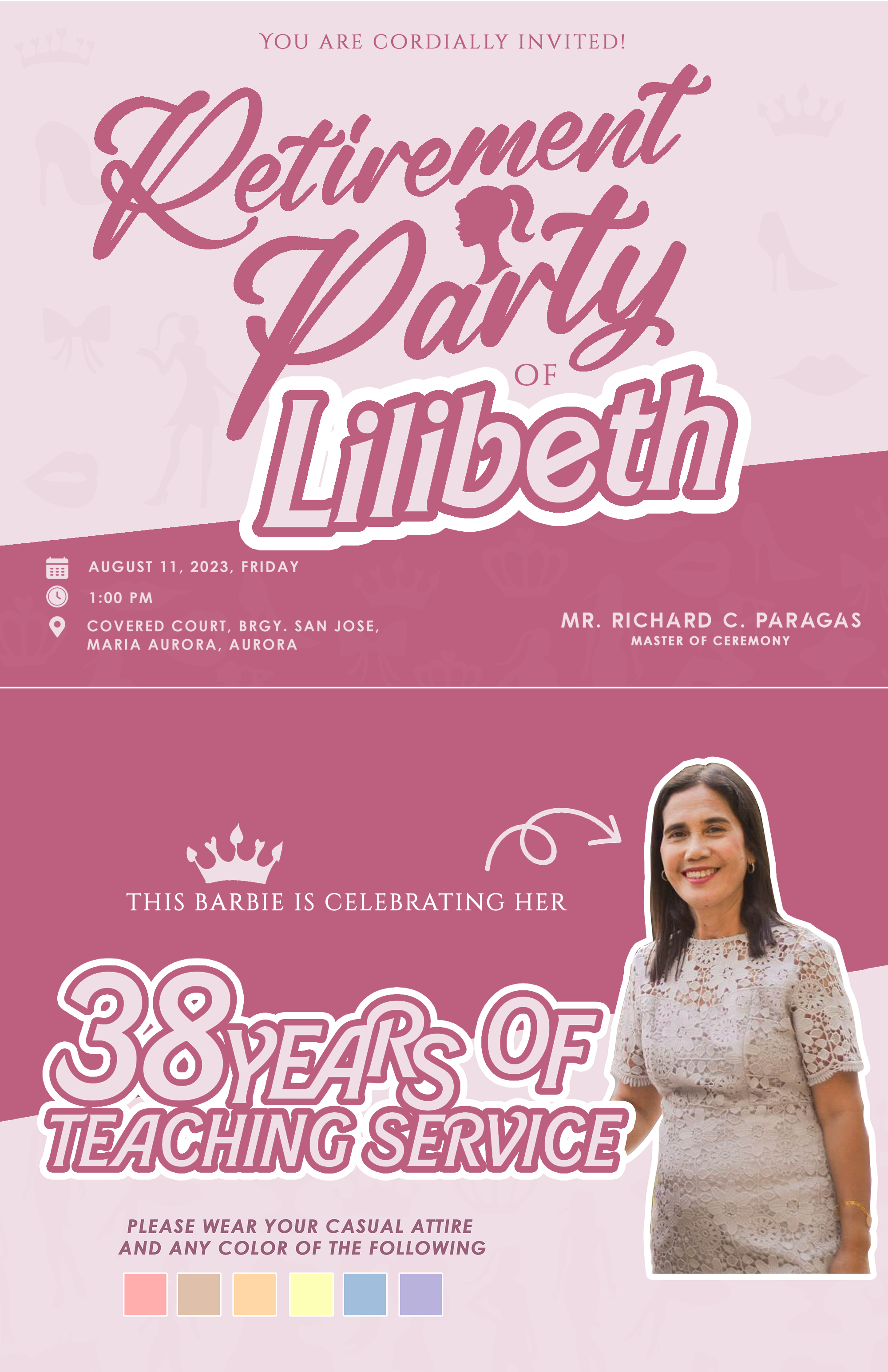
An invitation designed to celebrate 38 years of teaching service.